If you'd set up alerts on Plota before today, you managed them on a simple list page. It worked, but it wasn't great. You couldn't see what had changed, you couldn't browse the applications matching an alert without leaving the page, and on mobile it felt cramped. We've rebuilt the whole thing.
Meet the new My areas dashboard. One screen for every alert you've set up, with three tabs per alert - Overview, Applications, and Settings - and a sidebar that lets you switch between them in a click. Access it from the Manage your alerts link in any digest email - you need a signed-in session, so the URL on its own isn't enough.
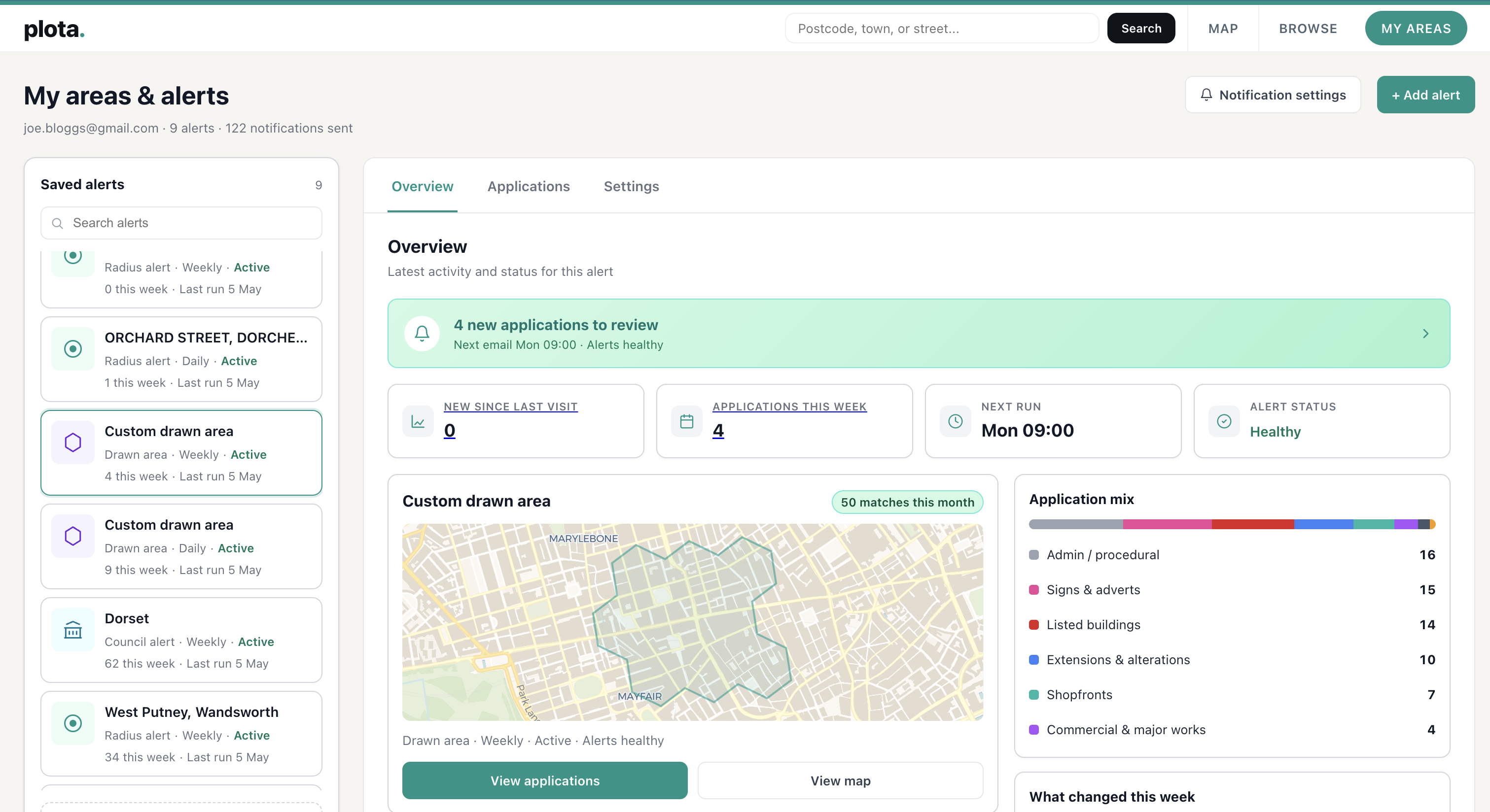
Overview: see what's happening at a glance
The Overview tab is the new front door. Across the top you get the numbers that matter - new applications since your last visit, applications this week, when the next email is going out, and the alert's overall health status.
Below that, a map of your alert area, a What changed this week breakdown by category, and an Application mix view showing the share of new homes, extensions, listed buildings, trees, and so on. Click any of those rows and you jump straight to the matching applications.
Applications: filter, sort, and see them on the map
The Applications tab is where you actually browse what's been picked up. A full table on the left with sortable columns, a side map on the right showing where each application sits inside your alert area, and a Filter button that opens up the same 15 categories used everywhere else on Plota.
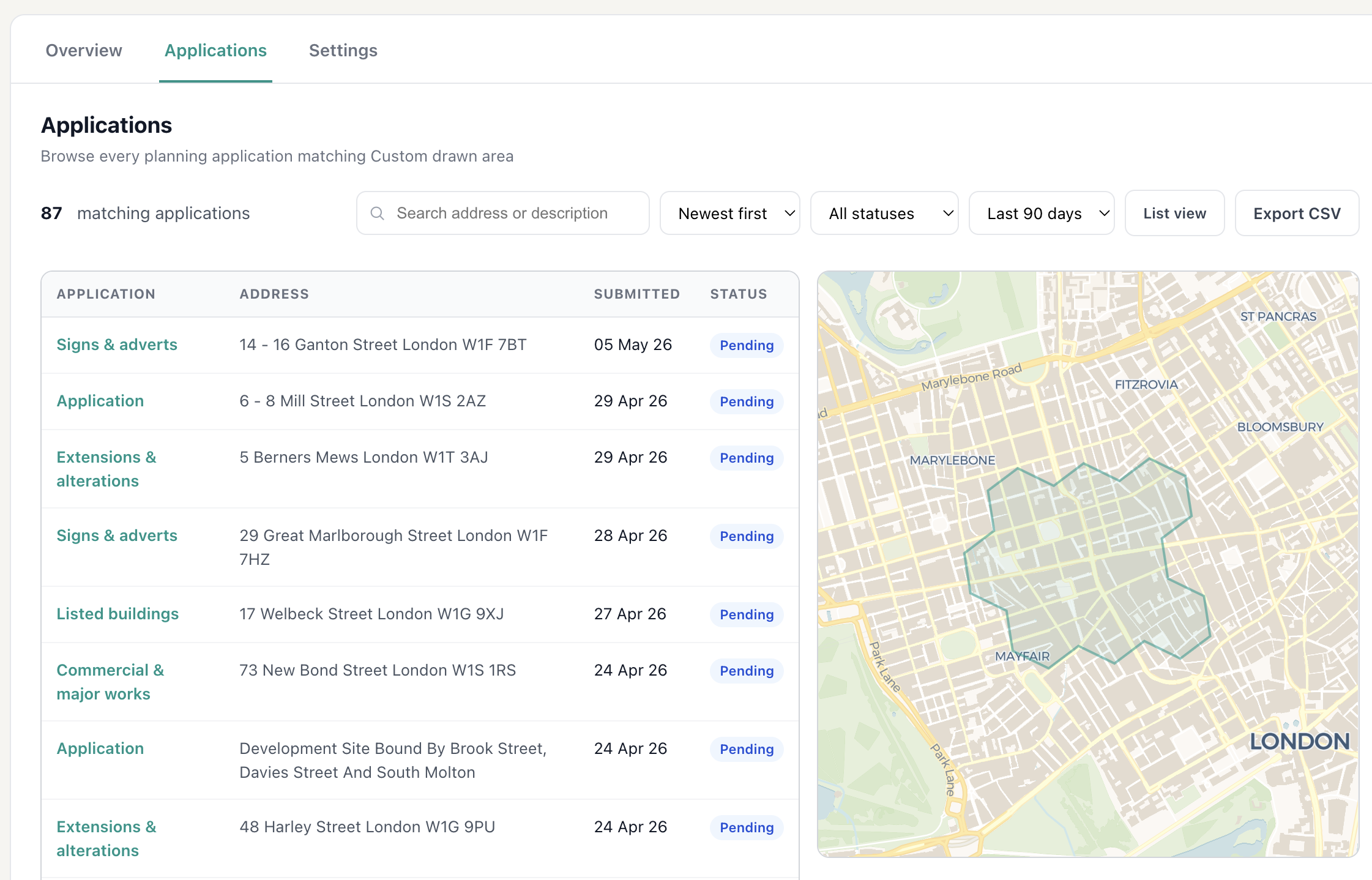
Search by address, sort by date, switch between split and list view, and export the filtered set as a CSV - useful if you want to share what's been happening with a neighbour or a planning consultant.
Settings
The Settings tab manages everything about the alert itself - frequency, day, time, area, tree filter, name.
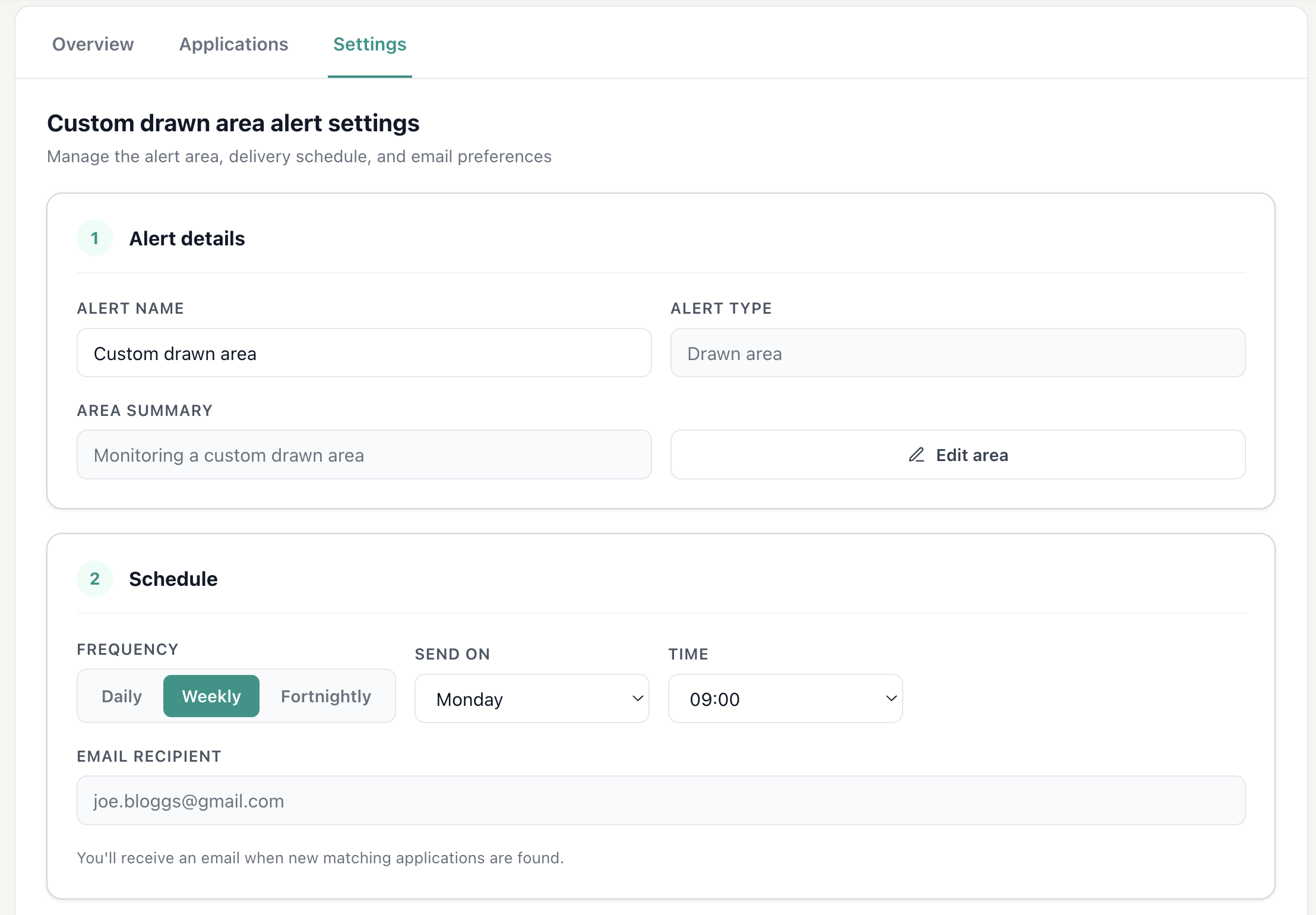
Pause an alert if you're going on holiday, change the day or time it lands in your inbox, switch to fortnightly digests, or duplicate an alert as a starting point for a new one. Editing the area itself - whether it's a postcode radius, a council, or a custom drawn boundary - is one click away.
Behind the scenes
A few less-visible improvements shipped at the same time. Page-to-page navigation inside the dashboard is now a single-page app, so clicking between tabs doesn't reload anything or jump the scroll. And every email's CTA now lands you on a pre-filtered Applications tab showing exactly the apps that were in your inbox, with pins on the map for each one.
It's at /my-areas from any link or email - the old /manage URL still works and forwards you over.